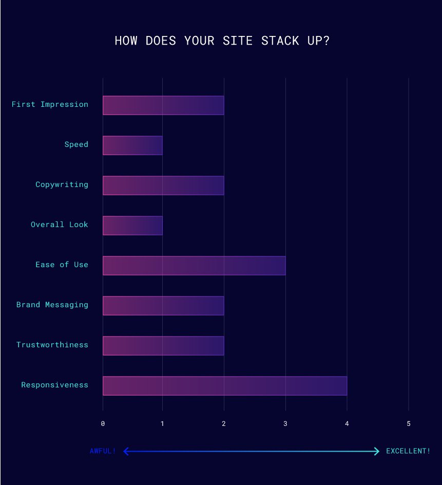
First Impression
Overall, there is a lot to be desired. The home page isn’t very informative at first glance. Deeper study reveals important content that should be more prominent.
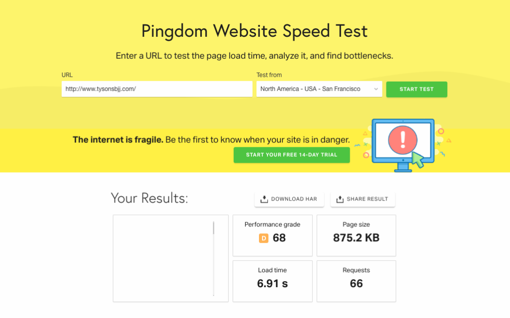
Speed
Studies show conversions reduce drastically for sites that take longer than 2 seconds to load. The longer it takes, the more likely the user is to bounce. 7 second load time due to poor quality hosting. Switch to cloud based solutions. You can find good hosts here. https://madebyproxy.com/resources
Copywriting
Cohesive, informative, and well written. Unfortunately, it was not displayed well. Typography was distracting and hierarchy (important aspects up front and center) was not used.
Overall Look
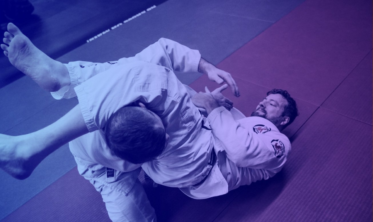
The overall look was cluttered and home made. It was clearly not professionally designed. Some pages appeared genuine while others looked like purely stock images.
Ease of Use
Technically okay from a user’s perspective. The goal is to book a free class, and the contact information was everywhere. By not taking advantage of available features, the site owner can not track site performance and must manually organize every class.
Brand Messaging
Just not good. Potentially losing different customer types by not accurately reflecting the company. The benefits and emotional connection is lost due to poor design. Try a more zen like aesthetic to echo the health, well-being , and personal growth aspects of these martial arts. The value associated with learning multiple martial arts was not emphasized properly.
Trust
The founder and team are extremely credible with amazing credentials, but that information is not featured properly. It is almost hidden. Further, there are no user reviews, awards, or associations to show trust.
Responsiveness
Looks good, but could be tweaked a bit further for a more mobile first experience, which google considers in ranking determinations. The navigation is multi-line on some screen sizes.
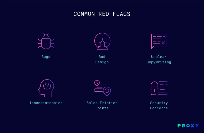
Bugs
Social buttons on some pages did not work.
Bad Design
Logo too complex and uses half of hero sections. Unused page space under sidebar was distracting.
Unclear Copywriting
Writing was good, but there was poor hierarchy and the best features were hidden.
Inconsistencies
Font stylings. Call to actions. These were different depending on the page.
Sales Friction Points
Would like to see automatic booking and confirmation for those that want an online only experience and easier for staff to manage.
Security Concerns
SSL is good. Keep plug-ins up to date to prevent attacks.