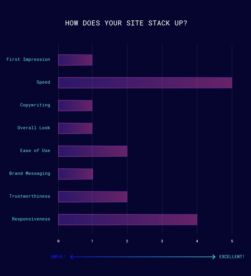
First Impression
Using Dutch on an American market will turn away 99% of users, but that aside it’s not immediately apparent what this site does. Is it a casino? Is it a repository of discount codes?
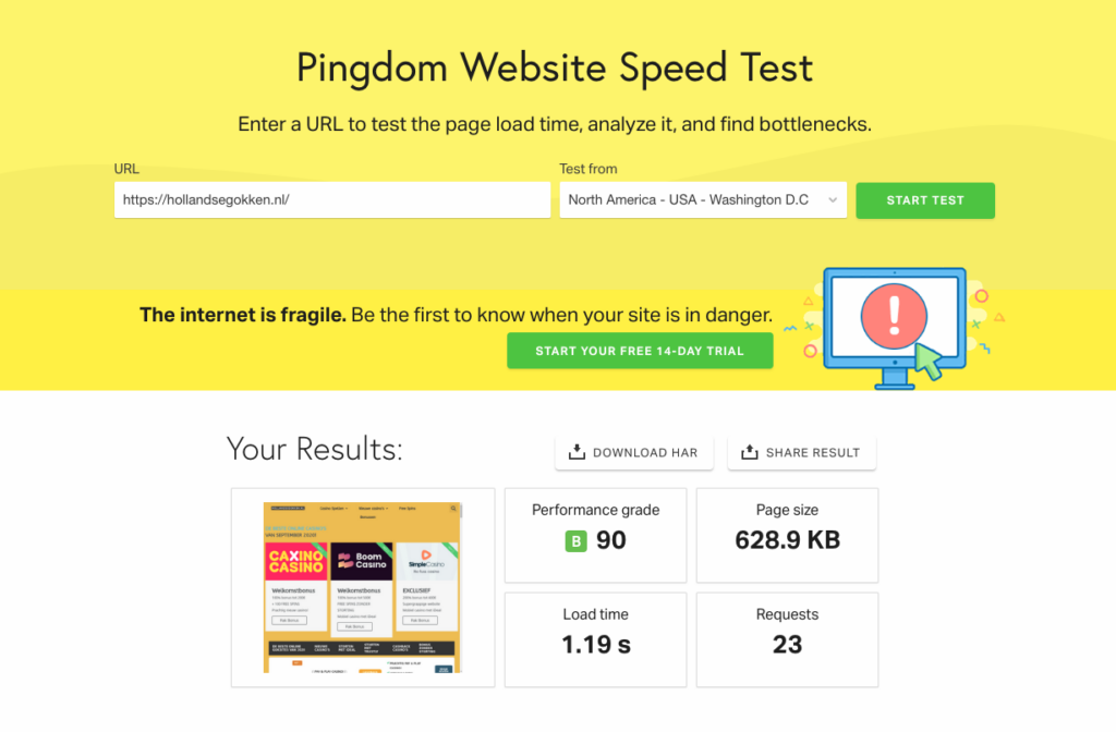
Speed
Studies show conversions reduce drastically for sites that take longer than 2 seconds to load. The longer it takes, the more likely the user is to bounce. Your site loads in under 2 seconds from across the ocean! Congrats! Whatever you are doing, keep it up!
Copywriting
Unfortunately, the language barrier makes it difficult to judge the copy accurately. Just from what I could translate, there are no direct call-to-actions and the copy looks long and highly unorganized.
Overall Look
The overall look was cluttered and home made. It was clearly not professionally designed.
Ease of Use
Technically okay from a user’s perspective. You click an affiliate link, and it takes you there!
Brand Messaging
It looks as if little thought was put into branding. The business name can not transcend geographic markets. There was a .nl in the logo. Including the url suffix in a logo is pretty dated. There were no consistent brand elements and nothing unique to Hollandsegokken. Try using a unified icon style or creating some illustrations that represent who you are.
Trust
SSL certificate looks good. However, I’d like to see some some user reviews or social media proof the brand is legitimate.
Responsiveness
Looks good, but could be tweaked a bit further for a more mobile first experience, which google considers in ranking determinations. The navigation is multi-line on some screen sizes. From what I could tell, the brand is focused on mobile gaming, so mobile first is key!
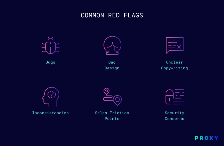
Bugs
There were a lot of broken and mismatched layouts, but no apparent bugs.
Bad Design
Lack of contrast made it difficult to read. Too much next and not enough hierarchy and image breaks.
Unclear Copywriting
Please consider using a language translation toggle.
Inconsistencies
Too many different button styles. Best practice is to limit to two types.
Sales Friction Points
Unsure what primary goal for user is. Consider gamifying the site and offering special codes for power users, free giveaways, targeted campaigns etc. As it stands now, there is no clear motivation for user.
Security Concerns
SSL is good. Keep plug-ins up to date to prevent attacks.